Writing and Art Design Thoughts
As of last week, writing for the full game has officially begun! I've started by working with the outlines of each character on a day-by-day basis. So far, I have Alice completed up to Day 5, and Lily and Pax up to Day 3 out of a total of 9 days you'll be house sitting for Uncle Phillip! Alice's Day 2 is actually almost entirely fleshed out, save for sprite and music notations. Alongside the writing, I've also been passively brainstorming all of the connections the Player can take and how to navigate them, since up until about Day 3, the Player can interact with around 2 characters per day, depending on the options they take. It'd be easier to just have the Player meet one character and then call it a day, but the beginning interactions will be shorter so it doesn't make sense to me why the Player would just...go home and do nothing after getting a cup of coffee. Of course, the option to go home and do nothing will be available for people who only want to interact with one character a day, but people will also have the chance to scope out their options for a day or so if they want to.
Working on all this writing is a nice break from the art side of this game that I had been focused on for so long while trying to get the demo out. I switched art programs, as well, since Clip Studio Paint no longer lines up with my interests as an artist. I'm trying out Krita now and I like it, but it's definitely a steep learning curve from CSP and I'm working on learning all the little tricks in my free time or breaks in writing. However, I think it's going to be a great program for achieving the more painted style backgrounds that I'm shooting for.
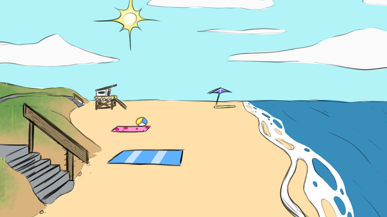
Ultimately, I didn't like the crisp lines of the backgrounds I made for the demo. They felt too harsh and I feel like they removed some focus from the sprites. Visual novels typically have a softer style of backgrounds; usually lineless and very detailed shading that lend to a more semi-realistic style but I feel like that both is out of my skill set and would clash with the more cartoony style of the sprites. So I'm thinking to create a softer style I'd like to try a more painted style. Basically more polished versions of the Beach and Velvet Park backgrounds from the demo.

It'll definitely be more work and experimentation to achieve the vibe I'm looking for, but I definitely think it's going to be worth it.
Lastly, since I know my dev logs are few and far between, I've made my roadmap public! I keep that a lot more updated since it's easier to check off some boxes than it is to sit down and type out all of my thoughts and processes. Check it out here: https://trello.com/b/3p9y7Yi6/fluff-crush-roadmap See you in the next update!
See you in the next update!
Get Fluff Crush Demo
Fluff Crush Demo
| Status | In development |
| Author | Khaoti |
| Genre | Visual Novel |
| Tags | Adult, Cute, Dating Sim, Furry, LGBTQIA, Ren'Py, Romance, Short, Singleplayer |
| Languages | English |
More posts
- Starting Gunther's StoryFeb 07, 2025
- Day 2 Progress!Jan 17, 2025
- Devlog - Fluff Crush FridaysJan 10, 2025
- Is Fluff Crush Still Being Worked On?Sep 18, 2024
- Alice and Eli Story Outlines CompletedJun 02, 2023
- Creative BlocksNov 22, 2022
- Bug FixSep 26, 2022
Leave a comment
Log in with itch.io to leave a comment.